Mobile-Friendly Isn't Optional: Testing Your Bradenton Business Site on a Phone
Website Fixes
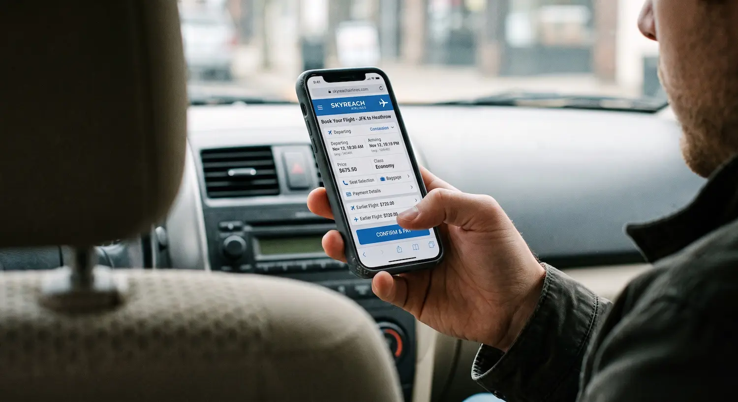
"Responsive" and "mobile-friendly" get used like they mean the same thing. They don't. A responsive site just resizes to fit a smaller screen. The layout shrinks, nothing crashes, technically it "works." Mobile-friendly means an actual person, holding their phone in one hand, can find your number, read your hours, and reach you without fighting the page.
This is a hands-on test, not a checklist to read and forget. Grab your phone, pull up your own site, and work through it as you go.
Key Takeaways
75% of smartphone interactions are thumb-driven, and 49% of people hold their phone in one hand while using it (Smashing Magazine, citing Steven Hoober and Josh Clark's research).
The W3C's own accessibility standard sets minimum tap targets at 44×44 CSS pixels (WCAG 2.5.5). Smaller buttons cause missed taps for everyone, not just users with accessibility needs.
Mobile now generates roughly 62.66% of global web traffic (DesignRush, citing Statcounter, 2025). For most Bradenton businesses, it's the majority experience, not a secondary one.
This whole test takes about five minutes and needs nothing but your own phone.
Why "Looks Fine on My Laptop" Doesn't Mean Mobile-Friendly
Most people don't hold their phone with two hands and both thumbs free. Research from Steven Hoober and Josh Clark found that 49% of people hold their phone one-handed, and 75% of all smartphone interactions are driven by the thumb alone (Smashing Magazine). That single fact explains almost every mobile usability problem: buttons placed where a thumb can't comfortably reach, or sized too small for a thumb to hit accurately.
Mobile isn't a secondary audience for most local businesses anymore. It's roughly 62.66% of global web traffic (DesignRush, citing Statcounter, 2025), and for a Bradenton business, that share is likely even higher. Someone searching for you is far more likely to be standing in a parking lot than sitting at a desk.
Website speed and Bradenton customers
Step 1: Pull Up Your Site on Your Actual Phone, on Cellular Data
Not WiFi. Turn it off, or step outside your building. Office WiFi is the fastest, most forgiving connection your site will ever see, and it hides exactly the problems your customers run into.
Open your homepage cold, like a stranger would. Don't navigate from a bookmark or a page you already know the layout of, and make sure you're looking at the real, live site. Not a preview link or a cached version you tested months ago. Sites get updated; the last time you checked isn't necessarily how it looks today.
Step 2: Try to Tap Everything Using Only Your Thumb
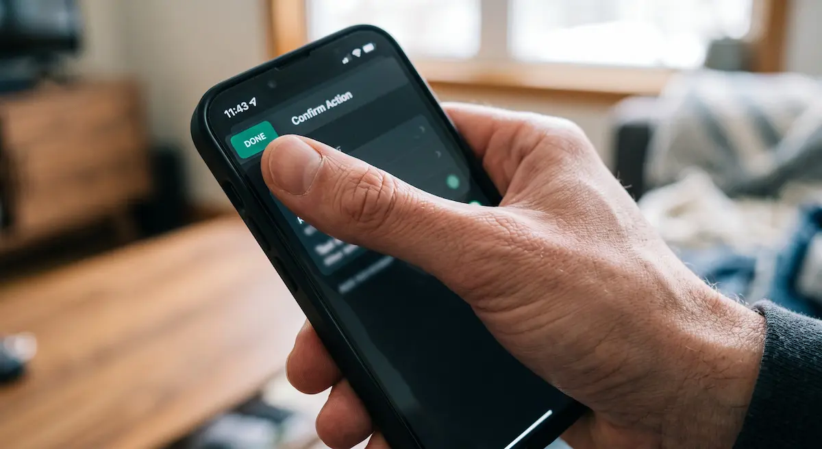
Hold your phone the way you actually hold it, one hand, thumb doing the work. Try to tap your phone number, your main call-to-action button, and your navigation menu without stretching or repositioning your grip.
The W3C's own accessibility standard requires touch targets of at least 44×44 CSS pixels (WCAG 2.5.5). That's not an arbitrary accessibility nitpick, it's roughly the size of an average adult thumb pad. If you find yourself missing a button, zooming in to tap accurately, or accidentally hitting the wrong link next to it, that button is too small or too close to its neighbors.
What we see on intake calls: the most common failure isn't a missing mobile version. It's a "mobile" layout where the buttons are just a shrunk-down copy of the desktop ones. They exist. They're just too small and too close together to actually use with a thumb.
Step 3: Try to Read It Without Zooming In
Scroll through your homepage and your most important service page without pinching to zoom. If you find yourself zooming in more than once or twice, your type is too small, or your line spacing is too tight for a phone screen.
Pay attention to anything layered on top of a photo. Text over images is one of the most common places contrast quietly fails on mobile, even when it reads fine on a bigger screen.
Step 4: Try to Call or Message the Business, Right From the Site
Tap your own phone number. Does it open your phone's dialer, or just sit there as plain text you'd have to copy and retype? Same test for email addresses and any "book now" or "message us" buttons.
This is the single highest-value tap on a mobile site, and it's the one most often left broken. A visitor who has to manually copy your number into their contacts app has already lost most of the motivation that got them there.
[INTERNAL-LINK: how often should a small business redesign its website → Spoke 7, when a mobile-usability gap is worth fixing now vs. on the next redesign cycle]
Step 5: Fill Out Your Own Contact Form, One-Handed
Try to complete your own contact or quote-request form using just your thumb, without rotating your phone to landscape. Notice whether the right keyboard shows up automatically. A phone-number field should open the number pad, not the full keyboard, and an email field should surface the @ symbol.
If your business takes bookings or reservations, this step matters even more. Date pickers and dropdown menus are some of the worst offenders on mobile. A calendar widget built for a mouse cursor can turn a two-tap booking into a frustrating scroll-and-pinch exercise. If you run a charter, restaurant, or rental business, that's the exact moment a potential customer gives up and calls a competitor instead.
If you find yourself annoyed, frustrated, or giving up partway through your own form, that's exactly what a real customer is doing, minus the patience to keep trying because they already know the business.
What to Do If Your Site Fails This Test
Failing one or two of these steps doesn't necessarily mean you need a full rebuild. Sometimes it's a targeted fix: bigger buttons, a clickable phone number, better spacing. Failing most of them, especially if your site was built years ago on a platform you've never been able to adjust, is a stronger signal that the mobile experience needs to be rebuilt from the layout up, not patched.
A useful way to tell the difference: if the problems are things a person could point at ("this button is too small," "this number isn't clickable"), that's usually maintenance. If the problem is that the whole layout feels like a shrunk-down desktop site rather than something designed for a phone in the first place, that's a structural issue no amount of small fixes will fully solve.
Does your website need a rebuild? The complete guide
Frequently Asked Questions
What's the minimum button size for a mobile website?
The W3C's accessibility standard sets 44×44 CSS pixels as the minimum touch target size (WCAG 2.5.5), based on the size needed to reliably hit a target with a thumb rather than a mouse cursor.
Is a responsive website the same as a mobile-friendly website?
Not necessarily. Responsive means the layout resizes to fit different screens without breaking. Mobile-friendly means the resized version is actually usable one-handed. Tappable buttons, readable text, and a working phone number are what make the difference.
Why does my phone number need to be clickable?
Because 75% of smartphone interactions are thumb-driven (Smashing Magazine), and a non-clickable number forces a visitor to manually copy and paste or retype it. That's extra friction at the exact moment they were ready to call.
How often should I re-test my site on mobile?
Any time you update your site, and at minimum once or twice a year even without changes. New phone screen sizes and browser updates can quietly break things that worked fine before.
The Bottom Line
This test takes about five minutes and costs nothing, and it tells you more about your real-world mobile experience than staring at your site on a laptop ever will. If you caught yourself struggling on your own site during any of these steps, your customers are struggling too. They just don't call to tell you.
Ran through this test and didn't love what you found? [CTA: Get a free, no-pressure mobile usability check — real answers on a real phone call, not an automated quote.]
Stay Inspired
Get fresh design insights, articles, and resources delivered straight to your inbox.